BERMEKARAN — Alam di Setiap Sudut
:root {
--beige: #F7F4D5;
--dark-green: #0A3323;
--rosy-brown: #D3968C;
--moss-green: #839958;
--midnight-green: #105666;
--product-white: #FCFAE8;
--white: #FFFFFF;
--text-muted: #52665A;
--border: rgba(10, 51, 35, 0.13);
--shadow: 0 16px 45px rgba(10, 51, 35, 0.09);
--shadow-hover: 0 22px 55px rgba(10, 51, 35, 0.15);
--radius-large: 28px;
--radius-medium: 18px;
--radius-small: 12px;
--container: 1180px;
}
* {
box-sizing: border-box;
margin: 0;
padding: 0;
}
html {
scroll-behavior: smooth;
scroll-padding-top: 28px;
width: 100%;
overflow-x: clip;
}
body {
font-family: Helvetica, Arial, sans-serif;
background: var(--beige);
color: var(--dark-green);
line-height: 1.7;
-webkit-font-smoothing: antialiased;
width: 100%;
overflow-x: clip;
}
img {
display: block;
max-width: 100%;
}
a {
color: inherit;
text-decoration: none;
}
button,
a {
-webkit-tap-highlight-color: transparent;
}
button,
input {
font: inherit;
}
button:focus-visible,
a:focus-visible {
outline: 3px solid var(--midnight-green);
outline-offset: 4px;
}
section {
padding: 92px 24px;
scroll-margin-top: 24px;
}
.container {
width: 100%;
max-width: var(--container);
min-width: 0;
margin-inline: auto;
}
.eyebrow {
display: inline-flex;
align-items: center;
gap: 10px;
margin-bottom: 18px;
color: var(--midnight-green);
font-size: 0.76rem;
font-weight: 700;
letter-spacing: 0.19em;
text-transform: uppercase;
}
.eyebrow::before {
content: "";
width: 30px;
height: 2px;
background: var(--rosy-brown);
}
.section-heading {
max-width: 690px;
margin-bottom: 42px;
}
.section-heading h2 {
font-size: clamp(2rem, 4vw, 3.2rem);
font-weight: 750;
line-height: 1.16;
letter-spacing: -0.045em;
}
.section-heading p {
max-width: 610px;
margin-top: 18px;
color: var(--text-muted);
font-size: 1rem;
}
.text-center {
text-align: center;
}
.text-center .section-heading {
margin-inline: auto;
}
.text-center .eyebrow {
justify-content: center;
}
.btn {
display: inline-flex;
align-items: center;
justify-content: center;
gap: 10px;
min-height: 52px;
padding: 14px 25px;
border: 1px solid transparent;
border-radius: 999px;
background: var(--rosy-brown);
color: var(--dark-green);
font-size: 0.91rem;
font-weight: 750;
text-align: center;
cursor: pointer;
transition:
transform 0.25s ease,
box-shadow 0.25s ease,
background 0.25s ease;
}
.btn:hover {
transform: translateY(-3px);
box-shadow: 0 10px 28px rgba(10, 51, 35, 0.13);
}
.btn-dark {
background: var(--dark-green);
color: var(--beige);
}
.btn-dark:hover {
background: var(--midnight-green);
}
.btn-outline {
border-color: var(--dark-green);
background: transparent;
color: var(--dark-green);
}
.btn-outline:hover {
background: var(--dark-green);
color: var(--beige);
}
.btn svg,
.icon svg {
width: 19px;
height: 19px;
flex-shrink: 0;
}
/* HEADER */
.site-header {
position: relative;
z-index: 10;
padding: 20px 24px 14px;
text-align: center;
}
.brand-logo {
display: inline-flex;
align-items: center;
justify-content: center;
min-height: 72px;
}
.brand-logo img {
width: min(250px, 64vw);
max-height: 100px;
object-fit: contain;
}
.brand-fallback {
display: none;
font-size: 1.8rem;
font-weight: 850;
letter-spacing: 0.16em;
}
.header-caption {
margin-top: 2px;
color: var(--midnight-green);
font-size: 0.7rem;
font-weight: 700;
letter-spacing: 0.24em;
text-transform: uppercase;
}
/* HERO */
.hero {
display: grid;
grid-template-columns: minmax(0, 1fr) minmax(0, 0.9fr);
align-items: center;
gap: clamp(36px, 6vw, 82px);
padding-top: 62px;
padding-bottom: 95px;
}
.hero-content {
max-width: 630px;
}
.hero h1 {
margin-bottom: 24px;
font-size: clamp(2.8rem, 5.3vw, 5rem);
font-weight: 800;
line-height: 1.04;
letter-spacing: -0.065em;
}
.hero h1 em {
color: var(--midnight-green);
font-weight: 750;
}
.hero-description {
max-width: 520px;
margin-bottom: 30px;
color: var(--text-muted);
font-size: 1.04rem;
line-height: 1.9;
}
.hero-actions {
display: flex;
flex-wrap: wrap;
align-items: center;
gap: 13px;
}
.hero-note {
display: flex;
align-items: center;
gap: 12px;
margin-top: 32px;
color: var(--midnight-green);
font-size: 0.85rem;
font-weight: 650;
}
.hero-note-line {
width: 35px;
height: 1px;
background: var(--rosy-brown);
}
.hero-visual {
position: relative;
min-width: 0;
}
.hero-image-frame {
position: relative;
overflow: hidden;
min-height: 360px;
aspect-ratio: 4 / 4.6;
border-radius: 44% 44% 24px 24px;
background: rgba(131, 153, 88, 0.2);
box-shadow: var(--shadow);
}
.hero-image-frame img {
width: 100%;
height: 100%;
position: absolute;
inset: 0;
object-fit: cover;
}
.image-fallback {
display: flex;
align-items: center;
justify-content: center;
padding: 24px;
background:
radial-gradient(ellipse at 25% 25%, rgba(247,244,213,.9), transparent 45%),
linear-gradient(145deg, #a5b482, #839958);
color: var(--dark-green);
font-size: 0.86rem;
font-weight: 700;
text-align: center;
}
.image-fallback img {
display: none;
}
.hero-stamp {
position: absolute;
right: -24px;
bottom: 35px;
display: flex;
align-items: center;
justify-content: center;
width: 112px;
height: 112px;
padding: 15px;
border: 5px solid var(--beige);
border-radius: 50%;
background: var(--rosy-brown);
color: var(--dark-green);
font-size: 0.7rem;
font-weight: 800;
line-height: 1.5;
text-align: center;
transform: rotate(9deg);
}
/* SMALL TRUST STRIP */
.trust-strip {
padding: 24px;
background: var(--dark-green);
color: var(--beige);
}
.trust-strip-inner {
display: grid;
grid-template-columns: repeat(3, 1fr);
gap: 20px;
max-width: var(--container);
margin: auto;
text-align: center;
}
.trust-item {
padding: 6px 12px;
font-size: 0.9rem;
font-weight: 650;
}
.trust-item span {
display: block;
margin-bottom: 3px;
color: var(--rosy-brown);
font-size: 0.72rem;
letter-spacing: 0.15em;
text-transform: uppercase;
}
/* FACILITIES */
.facilities-section {
padding-top: 100px;
padding-bottom: 100px;
}
.facilities-grid {
display: grid;
grid-template-columns: repeat(4, minmax(0, 1fr));
gap: 20px;
}
.facility-card {
overflow: hidden;
border: 1px solid rgba(10, 51, 35, 0.1);
border-radius: var(--radius-medium);
background: var(--product-white);
transition: transform 0.3s ease, box-shadow 0.3s ease;
}
.facility-card:hover {
transform: translateY(-5px);
box-shadow: var(--shadow);
}
.facility-image {
position: relative;
overflow: hidden;
aspect-ratio: 4 / 3;
background: rgba(131, 153, 88, 0.23);
}
.facility-image img {
width: 100%;
height: 100%;
object-fit: cover;
}
.facility-card-body {
padding: 22px 20px 24px;
}
.facility-number {
display: block;
margin-bottom: 9px;
color: var(--midnight-green);
font-size: 0.72rem;
font-weight: 800;
letter-spacing: 0.15em;
}
.facility-card h3 {
font-size: 1.05rem;
line-height: 1.4;
}
.facility-card p {
margin-top: 8px;
color: var(--text-muted);
font-size: 0.85rem;
line-height: 1.7;
}
/* FEATURED ASTER KRISAN */
.featured-section {
background: var(--moss-green);
}
.featured-layout {
display: grid;
grid-template-columns: minmax(0, 1fr) minmax(0, 1fr);
align-items: center;
gap: clamp(35px, 7vw, 90px);
}
.featured-image-wrap {
position: relative;
min-width: 0;
}
.featured-image {
overflow: hidden;
min-height: 350px;
aspect-ratio: 5 / 4.4;
border: 8px solid rgba(247, 244, 213, 0.55);
border-radius: var(--radius-large);
background: rgba(247, 244, 213, 0.3);
}
.featured-image img {
width: 100%;
height: 100%;
min-height: 350px;
object-fit: cover;
}
.featured-image-tag {
position: absolute;
right: -18px;
bottom: -18px;
max-width: 195px;
padding: 16px 20px;
border-radius: 16px;
background: var(--beige);
color: var(--dark-green);
box-shadow: var(--shadow);
font-size: 0.84rem;
font-weight: 750;
line-height: 1.5;
}
.featured-copy .eyebrow {
color: var(--dark-green);
}
.featured-copy h2 {
margin-bottom: 20px;
font-size: clamp(2rem, 4.2vw, 3.5rem);
font-weight: 800;
line-height: 1.1;
letter-spacing: -0.05em;
}
.featured-copy > p {
margin-bottom: 24px;
color: rgba(10, 51, 35, 0.9);
line-height: 1.85;
}
.benefit-list {
display: grid;
gap: 15px;
margin-bottom: 30px;
list-style: none;
}
.benefit-list li {
display: flex;
align-items: flex-start;
gap: 12px;
font-size: 0.95rem;
line-height: 1.65;
}
.check-mark {
display: flex;
align-items: center;
justify-content: center;
width: 23px;
height: 23px;
flex-shrink: 0;
margin-top: 2px;
border-radius: 50%;
background: var(--beige);
color: var(--dark-green);
font-size: 0.8rem;
font-weight: 900;
}
/* TARGET AUDIENCE */
.audience-section {
overflow: hidden;
}
.audience-layout {
display: grid;
grid-template-columns: minmax(0, 0.85fr) minmax(0, 1.15fr);
align-items: center;
gap: clamp(35px, 7vw, 92px);
}
.audience-intro h2 {
margin-bottom: 18px;
font-size: clamp(2rem, 4vw, 3.25rem);
font-weight: 800;
line-height: 1.12;
letter-spacing: -0.05em;
}
.audience-intro p {
color: var(--text-muted);
line-height: 1.85;
}
.audience-list {
display: grid;
gap: 14px;
}
.audience-card {
display: grid;
grid-template-columns: 78px minmax(0, 1fr);
align-items: center;
gap: 18px;
padding: 20px;
border: 1px solid var(--border);
border-radius: var(--radius-medium);
background: rgba(252, 250, 232, 0.72);
transition: transform 0.25s ease, background 0.25s ease, box-shadow 0.25s ease;
}
.audience-card:hover {
transform: translateX(5px);
background: var(--product-white);
box-shadow: 0 12px 30px rgba(10, 51, 35, 0.07);
}
.audience-image {
position: relative;
width: 78px;
height: 78px;
flex-shrink: 0;
}
.audience-image img {
width: 100%;
height: 100%;
border-radius: 15px;
object-fit: cover;
background: rgba(131, 153, 88, 0.2);
}
.audience-number {
position: absolute;
right: -6px;
bottom: -6px;
display: flex;
align-items: center;
justify-content: center;
width: 27px;
height: 27px;
border: 2px solid var(--product-white);
border-radius: 50%;
background: var(--rosy-brown);
color: var(--dark-green);
font-size: 0.68rem;
font-weight: 800;
}
.audience-card h3 {
margin-bottom: 5px;
font-size: 1.02rem;
line-height: 1.5;
}
.audience-card p {
color: var(--text-muted);
font-size: 0.9rem;
line-height: 1.7;
}
/* TESTIMONI PELANGGAN — CAROUSEL RESPONSIF */
.testimonials-section {
overflow: hidden;
background: rgba(131, 153, 88, 0.14);
}
.testimonial-slider-shell {
width: 100%;
min-width: 0;
}
.testimonial-slider {
width: 100%;
min-width: 0;
overflow-x: auto;
overflow-y: hidden;
padding: 4px 2px 18px;
scroll-snap-type: x mandatory;
scroll-padding-inline: 2px;
scroll-behavior: smooth;
overscroll-behavior-x: contain;
-webkit-overflow-scrolling: touch;
scrollbar-width: thin;
scrollbar-color: var(--moss-green) transparent;
}
.testimonial-track {
display: flex;
align-items: stretch;
width: max-content;
max-width: none;
gap: 20px;
}
.testimonial-card {
display: flex;
flex: 0 0 clamp(260px, calc((100vw - 88px) / 3), 380px);
flex-direction: column;
align-items: flex-start;
width: auto;
min-width: 0;
min-height: 285px;
padding: 26px;
border: 1px solid var(--border);
border-radius: var(--radius-medium);
background: var(--product-white);
box-shadow: 0 10px 30px rgba(10, 51, 35, 0.05);
overflow-wrap: anywhere;
scroll-snap-align: start;
scroll-snap-stop: always;
}
.testimonial-quote-mark {
margin-bottom: 12px;
color: var(--rosy-brown);
font-family: Georgia, serif;
font-size: 3.6rem;
font-weight: 700;
line-height: 0.8;
}
.testimonial-card blockquote {
flex: 1;
min-width: 0;
color: var(--text-muted);
font-size: 0.94rem;
line-height: 1.85;
overflow-wrap: anywhere;
}
.testimonial-customer {
width: 100%;
margin-top: 22px;
padding-top: 14px;
border-top: 1px solid var(--border);
color: var(--dark-green);
font-size: 0.84rem;
font-weight: 800;
letter-spacing: 0.02em;
}
.testimonial-controls {
display: flex;
justify-content: flex-end;
gap: 10px;
margin-top: 10px;
}
.testimonial-nav {
display: inline-flex;
align-items: center;
justify-content: center;
width: 44px;
height: 44px;
border: 1px solid rgba(10, 51, 35, 0.2);
border-radius: 50%;
background: var(--product-white);
color: var(--dark-green);
cursor: pointer;
transition: background 0.2s ease, color 0.2s ease, transform 0.2s ease;
}
.testimonial-nav:hover {
background: var(--dark-green);
color: var(--beige);
transform: translateY(-2px);
}
.testimonial-nav svg {
width: 19px;
height: 19px;
}
/* PRODUCT CATALOG */
.catalog-section {
background: rgba(131, 153, 88, 0.14);
}
.catalog-header {
display: block;
width: 100%;
margin-bottom: 38px;
}
.catalog-header .section-heading {
width: 100%;
max-width: 780px;
margin-bottom: 0;
}
.catalog-header .section-heading h2 {
max-width: 760px;
}
.catalog-header .section-heading > p:not(.catalog-note) {
max-width: 700px;
margin-top: 16px;
line-height: 1.8;
}
.catalog-note {
display: block;
width: 100%;
max-width: 700px;
margin-top: 18px;
padding: 12px 16px;
border-left: 3px solid var(--rosy-brown);
border-radius: 0 10px 10px 0;
background: rgba(252, 250, 232, 0.74);
color: var(--text-muted);
font-size: 0.88rem;
line-height: 1.7;
overflow-wrap: break-word;
}
.product-grid {
display: grid;
grid-template-columns: repeat(4, minmax(0, 1fr));
gap: 22px;
}
.product-card {
display: flex;
flex-direction: column;
overflow: hidden;
min-width: 0;
border: 1px solid rgba(10, 51, 35, 0.09);
border-radius: var(--radius-medium);
background: var(--product-white);
transition: transform 0.3s ease, box-shadow 0.3s ease;
}
.product-card:hover {
transform: translateY(-6px);
box-shadow: var(--shadow-hover);
}
.product-image {
position: relative;
overflow: hidden;
aspect-ratio: 4 / 4.15;
background: #e9e9d0;
}
.product-image img {
width: 100%;
height: 100%;
object-fit: cover;
transition: transform 0.45s ease;
}
.product-card:hover .product-image img {
transform: scale(1.05);
}
.product-content {
display: flex;
flex: 1;
flex-direction: column;
align-items: flex-start;
padding: 20px;
}
.product-category {
margin-bottom: 8px;
color: var(--midnight-green);
font-size: 0.69rem;
font-weight: 750;
letter-spacing: 0.12em;
text-transform: uppercase;
}
.product-content h3 {
min-height: 52px;
font-size: 1.06rem;
font-weight: 750;
line-height: 1.45;
}
.product-price {
margin-top: 12px;
margin-bottom: 21px;
font-size: 1.3rem;
font-weight: 850;
letter-spacing: -0.03em;
}
.product-content .btn {
width: 100%;
margin-top: auto;
padding-inline: 12px;
font-size: 0.82rem;
}
.product-content .btn svg {
width: 17px;
height: 17px;
}
.catalog-bottom-note {
margin-top: 30px;
color: var(--text-muted);
font-size: 0.86rem;
text-align: center;
}
/* CLOSING CTA */
.closing-section {
padding: 95px 24px;
background: var(--beige);
}
.closing-card {
position: relative;
overflow: hidden;
max-width: var(--container);
margin-inline: auto;
padding: clamp(36px, 7vw, 82px);
border-radius: 32px;
background: var(--dark-green);
color: var(--beige);
text-align: center;
}
.closing-card::before,
.closing-card::after {
position: absolute;
width: 240px;
height: 240px;
border: 1px solid rgba(211, 150, 140, 0.38);
border-radius: 50%;
content: "";
pointer-events: none;
}
.closing-card::before {
top: -150px;
left: -90px;
}
.closing-card::after {
right: -110px;
bottom: -155px;
width: 310px;
height: 310px;
}
.closing-card .eyebrow {
color: var(--rosy-brown);
justify-content: center;
}
.closing-card h2 {
max-width: 760px;
margin: 0 auto 23px;
font-size: clamp(2.1rem, 5vw, 4rem);
font-weight: 800;
line-height: 1.1;
letter-spacing: -0.055em;
}
.closing-card > p {
max-width: 690px;
margin: 0 auto 27px;
color: rgba(247, 244, 213, 0.86);
line-height: 1.9;
}
.closing-tagline {
display: block;
max-width: 720px;
margin: 0 auto 32px;
color: var(--rosy-brown);
font-size: clamp(1.05rem, 2.2vw, 1.4rem);
font-style: italic;
font-weight: 800;
line-height: 1.7;
}
.closing-actions {
position: relative;
z-index: 1;
display: grid;
grid-template-columns: repeat(3, minmax(0, 1fr));
align-items: stretch;
gap: 12px;
}
.closing-actions .btn {
width: 100%;
min-width: 0;
padding-inline: 14px;
overflow-wrap: anywhere;
}
.btn-shopee {
border-color: #EE4D2D;
background: #EE4D2D;
color: #FFFFFF;
}
.btn-shopee:hover {
border-color: #D83F21;
background: #D83F21;
}
.btn-tiktok {
border-color: #111111;
background: #111111;
color: #FFFFFF;
}
.btn-tiktok:hover {
border-color: #333333;
background: #333333;
}
.closing-note {
margin-top: 18px;
color: rgba(247, 244, 213, 0.65);
font-size: 0.78rem;
}
/* FOOTER */
.site-footer {
padding: 30px 24px;
background: var(--midnight-green);
color: var(--beige);
}
.footer-inner {
display: flex;
align-items: center;
justify-content: space-between;
gap: 20px;
max-width: var(--container);
margin-inline: auto;
}
.footer-brand {
font-size: 1.05rem;
font-weight: 850;
letter-spacing: 0.14em;
}
.footer-description {
margin-top: 3px;
color: rgba(247, 244, 213, 0.76);
font-size: 0.82rem;
}
.footer-copy {
color: rgba(247, 244, 213, 0.76);
font-size: 0.8rem;
text-align: right;
}
/* FLOATING WHATSAPP */
.floating-wa {
position: fixed;
z-index: 100;
right: 24px;
bottom: 24px;
display: flex;
align-items: center;
justify-content: center;
width: 62px;
height: 62px;
border: 3px solid var(--beige);
border-radius: 50%;
background: var(--rosy-brown);
color: var(--dark-green);
box-shadow: 0 8px 30px rgba(10, 51, 35, 0.24);
transition: transform 0.25s ease, box-shadow 0.25s ease;
}
.floating-wa:hover {
transform: translateY(-4px) scale(1.04);
box-shadow: 0 12px 36px rgba(10, 51, 35, 0.28);
}
.floating-wa svg {
width: 29px;
height: 29px;
}
.sr-only {
position: absolute;
overflow: hidden;
width: 1px;
height: 1px;
padding: 0;
border: 0;
clip: rect(0, 0, 0, 0);
white-space: nowrap;
clip-path: inset(50%);
}
/* RESPONSIVE: DESKTOP, TABLET, MOBILE */
@media (max-width: 1024px) {
section {
padding: 76px 24px;
}
.facilities-grid,
.product-grid {
grid-template-columns: repeat(2, minmax(0, 1fr));
}
.facility-card,
.product-card,
.audience-card {
min-width: 0;
}
.facility-card-body {
padding: 20px;
}
.product-content h3 {
min-height: 0;
}
.closing-actions {
grid-template-columns: repeat(2, minmax(0, 1fr));
}
.closing-actions .btn:first-child {
grid-column: 1 / -1;
}
.footer-inner {
flex-wrap: wrap;
}
}
@media (max-width: 900px) {
.hero {
grid-template-columns: minmax(0, 1fr);
gap: 34px;
padding-top: 40px;
padding-bottom: 68px;
}
.hero-content {
max-width: 720px;
}
.hero-visual {
width: min(100%, 650px);
margin-inline: auto;
}
.hero-image-frame {
min-height: 0;
aspect-ratio: 16 / 10;
border-radius: 30px;
}
.hero-stamp {
right: 16px;
bottom: 20px;
}
.featured-layout,
.audience-layout {
grid-template-columns: minmax(0, 1fr);
gap: 36px;
}
.featured-image-wrap {
width: min(100%, 620px);
margin-inline: auto;
}
.featured-copy,
.audience-intro {
max-width: 720px;
}
.audience-card {
grid-template-columns: 78px minmax(0, 1fr);
}
.testimonial-card {
flex-basis: clamp(280px, 42vw, 340px);
}
}
@media (max-width: 760px) {
.site-header {
padding: 14px 20px 12px;
}
.hero h1 {
font-size: clamp(2.55rem, 8.5vw, 4.2rem);
}
.hero-image-frame {
aspect-ratio: 5 / 4;
}
.hero-stamp {
right: 10px;
bottom: 16px;
width: 92px;
height: 92px;
font-size: 0.64rem;
}
.trust-strip-inner {
grid-template-columns: 1fr;
gap: 12px;
}
.trust-item {
padding-block: 8px;
}
.trust-item + .trust-item {
border-top: 1px solid rgba(247, 244, 213, 0.16);
}
.footer-inner {
align-items: flex-start;
flex-direction: column;
}
.footer-copy {
text-align: left;
}
}
@media (max-width: 520px) {
section {
padding: 62px 18px;
}
.site-header {
padding-inline: 18px;
}
.brand-logo {
min-height: 62px;
}
.brand-logo img {
width: min(215px, 68vw);
}
.header-caption {
font-size: 0.63rem;
letter-spacing: 0.16em;
}
.hero {
gap: 28px;
padding-top: 28px;
padding-bottom: 58px;
}
.hero h1 {
font-size: clamp(2.35rem, 10vw, 3.2rem);
}
.hero-description {
font-size: 0.96rem;
}
.hero-actions {
align-items: stretch;
flex-direction: column;
}
.hero-actions .btn {
width: 100%;
}
.hero-image-frame {
min-height: 0;
aspect-ratio: 4 / 3;
}
.hero-stamp {
right: 7px;
bottom: 12px;
width: 78px;
height: 78px;
padding: 9px;
border-width: 3px;
font-size: 0.55rem;
}
.section-heading h2 {
font-size: clamp(1.9rem, 8vw, 2.35rem);
}
.facilities-grid {
grid-template-columns: minmax(0, 1fr);
gap: 16px;
}
.facility-card {
display: grid;
grid-template-columns: minmax(104px, 0.78fr) minmax(0, 1.22fr);
align-items: stretch;
}
.facility-image {
height: 100%;
min-height: 150px;
aspect-ratio: auto;
}
.facility-card-body {
align-self: center;
padding: 14px 13px;
}
.facility-card h3 {
font-size: 0.96rem;
overflow-wrap: anywhere;
}
.facility-card p {
font-size: 0.8rem;
overflow-wrap: anywhere;
}
.featured-image,
.featured-image img {
min-height: 240px;
}
.featured-image-tag {
right: 4px;
bottom: -12px;
max-width: 165px;
padding: 12px 14px;
font-size: 0.75rem;
}
.audience-card {
grid-template-columns: 58px minmax(0, 1fr);
gap: 13px;
padding: 15px;
}
.audience-image {
width: 58px;
height: 58px;
}
.audience-image img {
border-radius: 12px;
}
.audience-number {
right: -5px;
bottom: -5px;
width: 23px;
height: 23px;
font-size: 0.62rem;
}
.audience-card h3 {
font-size: 0.95rem;
overflow-wrap: anywhere;
}
.audience-card p {
font-size: 0.84rem;
overflow-wrap: anywhere;
}
.testimonial-slider {
scroll-padding-inline: 2px;
}
.testimonial-track {
gap: 14px;
}
.testimonial-card {
flex-basis: min(330px, calc(100vw - 52px));
min-height: 0;
padding: 22px;
}
.testimonial-controls {
margin-top: 8px;
}
.testimonial-nav {
width: 42px;
height: 42px;
}
.catalog-header .section-heading > p:not(.catalog-note) {
margin-top: 14px;
}
.catalog-note {
margin-top: 15px;
padding: 11px 13px;
}
.testimonial-card blockquote {
font-size: 0.9rem;
}
.product-grid {
grid-template-columns: minmax(0, 1fr);
gap: 16px;
}
.product-card {
display: grid;
grid-template-columns: minmax(0, 0.82fr) minmax(0, 1.18fr);
}
.product-image {
height: 100%;
min-height: 190px;
aspect-ratio: auto;
}
.product-content {
min-width: 0;
padding: 16px 13px;
}
.product-content h3 {
font-size: 0.96rem;
overflow-wrap: anywhere;
}
.product-price {
margin-top: 9px;
margin-bottom: 15px;
font-size: 1.13rem;
}
.product-content .btn {
min-height: 44px;
padding-inline: 9px;
font-size: 0.74rem;
}
.closing-section {
padding: 58px 18px;
}
.closing-card {
padding: 38px 20px;
border-radius: 24px;
}
.closing-card h2 {
font-size: clamp(2rem, 9vw, 2.5rem);
}
.closing-card > p {
font-size: 0.92rem;
overflow-wrap: anywhere;
}
.closing-actions {
grid-template-columns: minmax(0, 1fr);
}
.closing-actions .btn:first-child {
grid-column: auto;
}
.closing-actions .btn {
width: 100%;
min-width: 0;
padding-inline: 14px;
}
.footer-inner {
gap: 14px;
}
.floating-wa {
right: 14px;
bottom: 14px;
width: 54px;
height: 54px;
}
}
@media (prefers-reduced-motion: reduce) {
*,
*::before,
*::after {
scroll-behavior: auto !important;
transition-duration: 0.01ms !important;
animation-duration: 0.01ms !important;
animation-iteration-count: 1 !important;
}
}
Tumbuh Bersama Keindahan
Hadirkan Keindahan Alam di Setiap Sudut.
BERMEKARAN merupakan toko tanaman hias dan bunga hidup yang
menyediakan beragam pilihan tanaman indoor maupun outdoor. Temukan
tanaman yang sesuai dengan gaya Anda untuk menciptakan suasana yang
lebih segar, asri, indah, dan penuh warna di setiap sudut.
GROW YOUR
01 / Pilihan
Tanaman untuk Berbagai Kebutuhan
02 / Perhatian
Layanan yang Bersahabat
03 / Kemudahan
Pemesanan via WhatsApp
Nyaman dari Awal
Lebih Mudah Menemukan Tanaman Favorit Anda.
Kami ingin pengalaman memilih tanaman terasa menyenangkan.
Jelajahi pilihan produk dan layanan BERMEKARAN yang dirancang
untuk membantu kebutuhan Anda.
LAYANAN 01
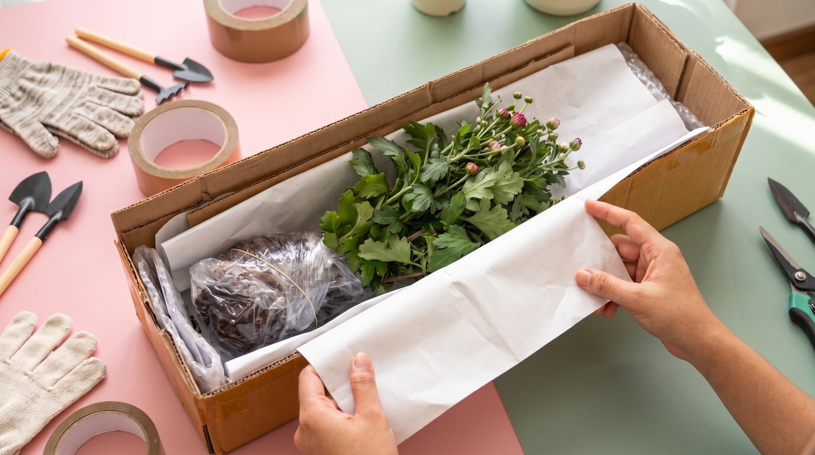
Packing Aman Untuk Tanaman
Pengemasan diperhatikan agar tanaman lebih terlindungi
selama proses pengiriman.
LAYANAN 02
Pilihan Tanaman Yang Beragam
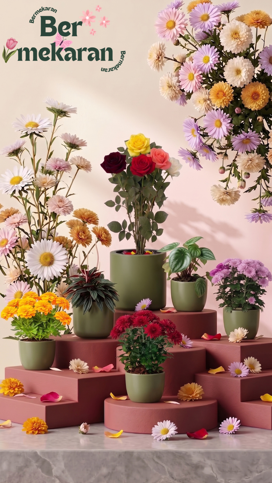
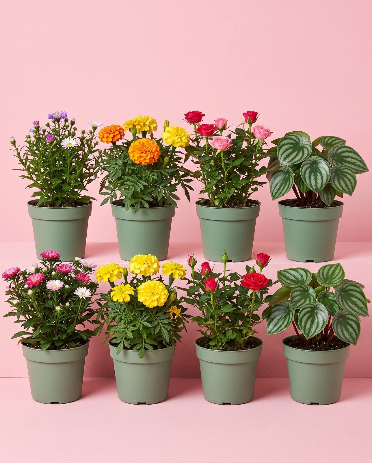
Temukan tanaman hias dan bunga untuk melengkapi ruang
maupun taman kesayangan Anda.
LAYANAN 03
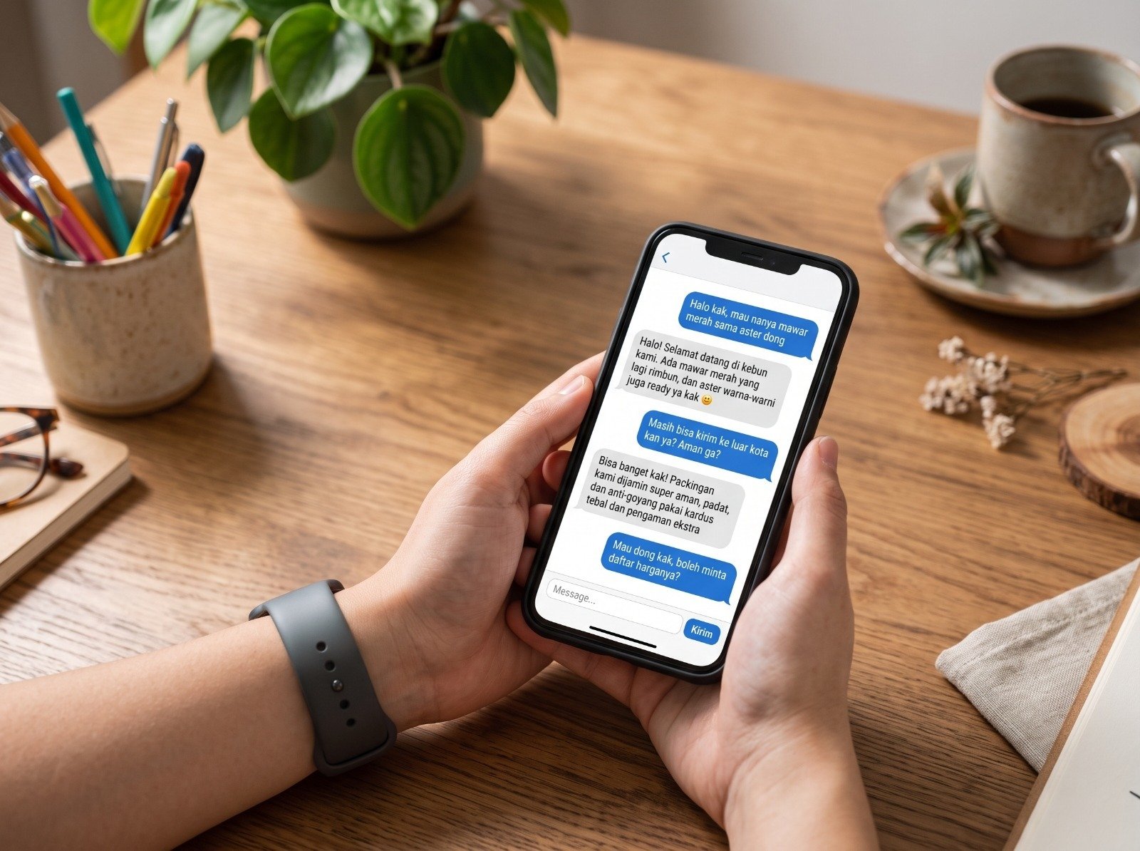
Layanan Konsultasi Pelanggan
Tanyakan kebutuhan tanaman Anda kepada tim kami
sebelum melakukan pemesanan.
LAYANAN 04
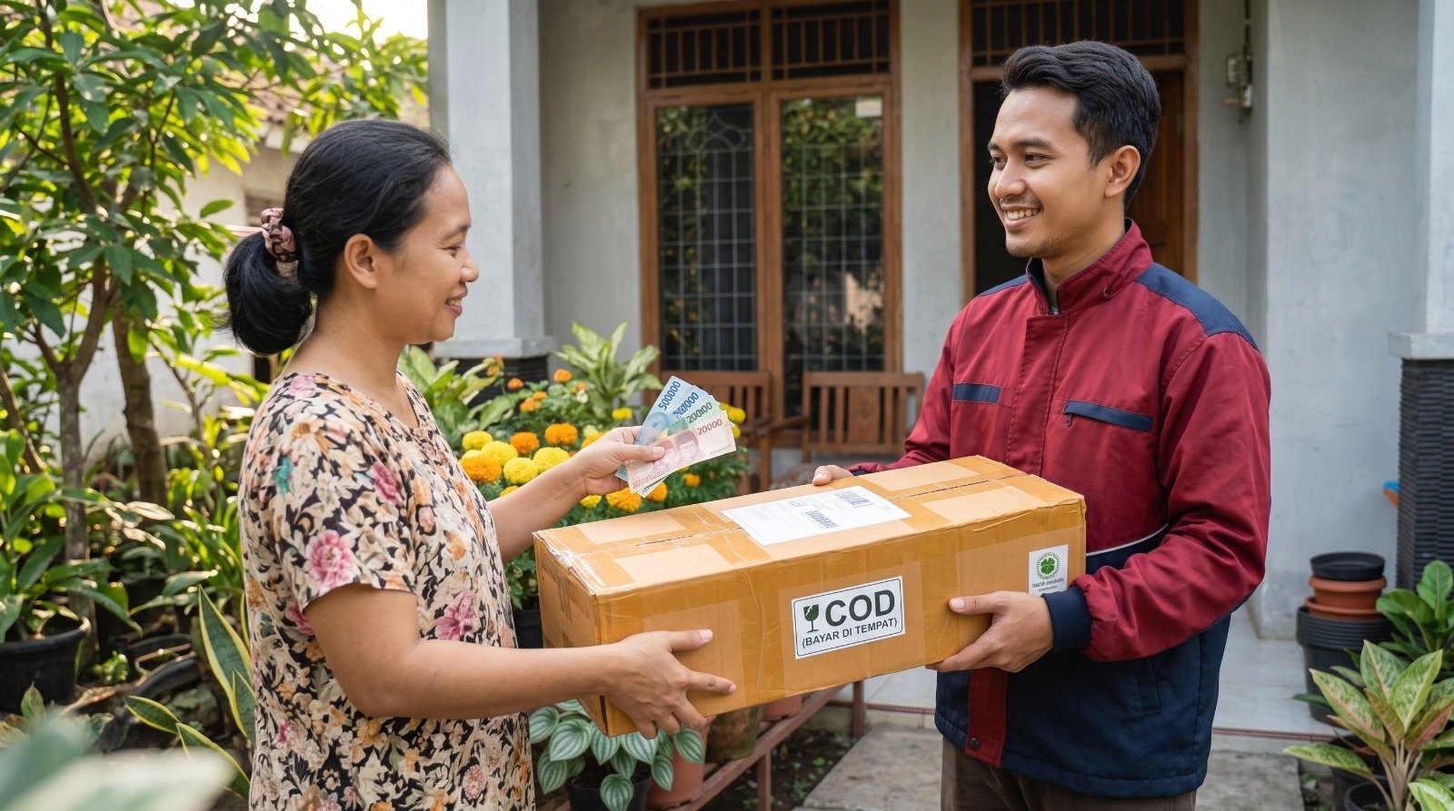
Bayar Di Tempat (COD)
Tanyakan ketersediaan layanan COD, area yang dilayani,
dan ketentuan pembayaran kepada tim kami.
Tujuh warna untuk suasana yang lebih hidup.
Pilihan Istimewa
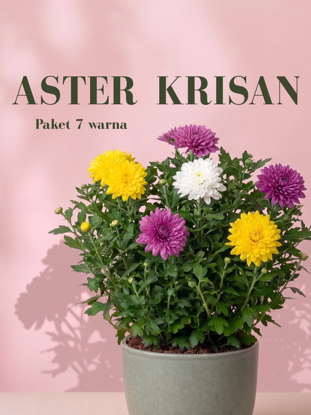
Produk Unggulan: Aster Krisan Paket 7 Warna.
Pilihan tepat bagi Anda yang ingin mempercantik rumah atau taman
dengan bunga yang berwarna-warni. Paket Aster Krisan 7 Warna
memberikan lebih banyak variasi dalam satu koleksi. Cocok bagi
pecinta tanaman hias, dapat ditanam di pot maupun pekarangan,
serta memiliki perawatan yang relatif mudah.
✓
Warna beragam: 7 tanaman dengan pilihan warna berbeda.
✓
Mekar menarik: bunga yang dapat mempercantik tampilan koleksi tanaman Anda.
✓
Untuk taman dan dekorasi rumah: cocok untuk pot, pekarangan, dan sudut favorit Anda.
✓
Mudah dirawat: siram secara rutin, sediakan sinar matahari yang cukup, dan berikan pupuk sesuai kebutuhan.
Tanya Produk via WhatsApp
Tanaman untuk Anda
Produk ini cocok untuk kamu:
Setiap orang punya caranya sendiri untuk menikmati keindahan
alam. Temukan tanaman yang sesuai dengan minat, ruang, dan
momen spesial Anda bersama BERMEKARAN.
01
Pecinta Tanaman (Plant Lovers)
Untuk kamu yang hobi mengoleksi, merawat, dan menikmati
keindahan tanaman hias.
02
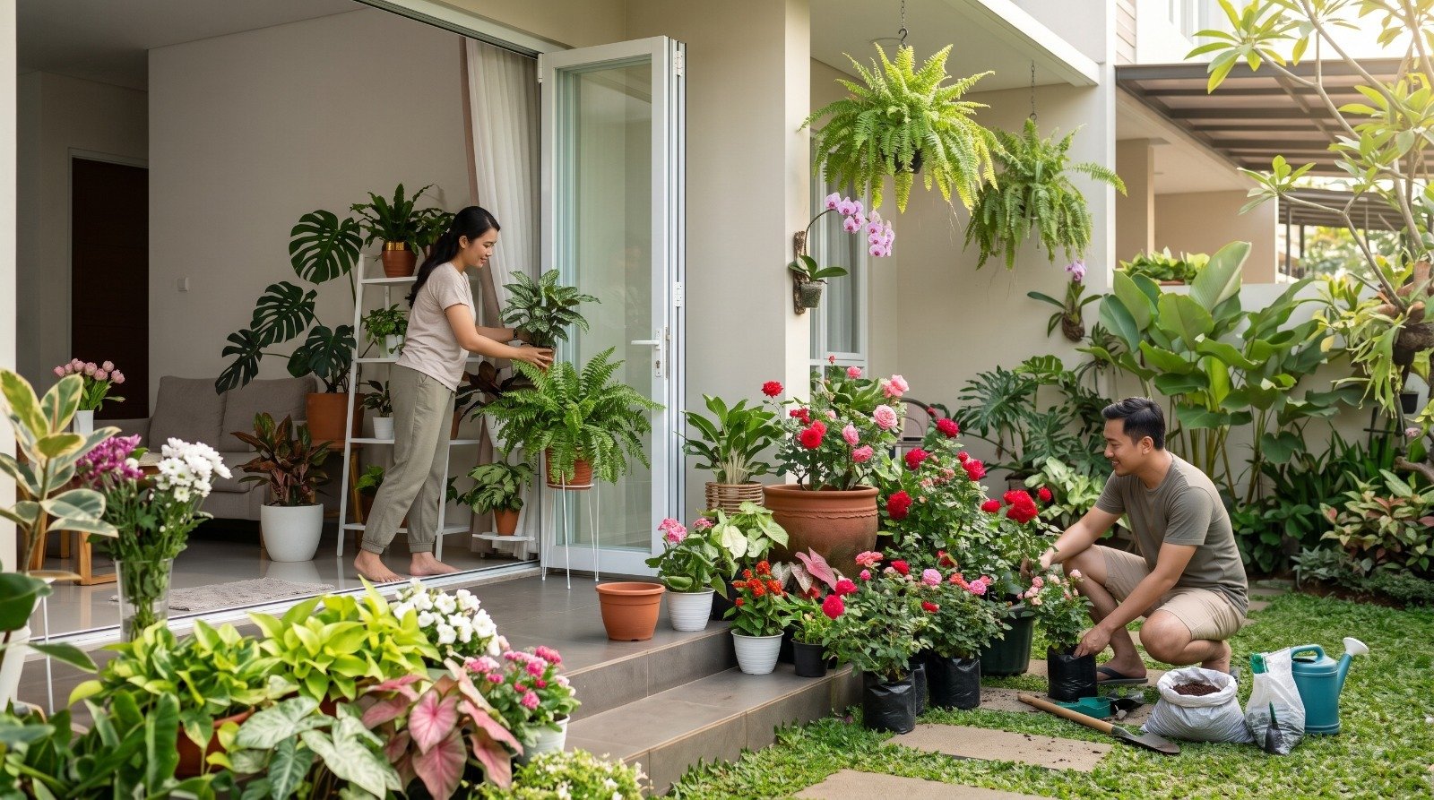
Pemilik Rumah & Apartemen
Percantik interior, balkon, teras, dan halaman dengan
sentuhan hijau yang menyegarkan.
03
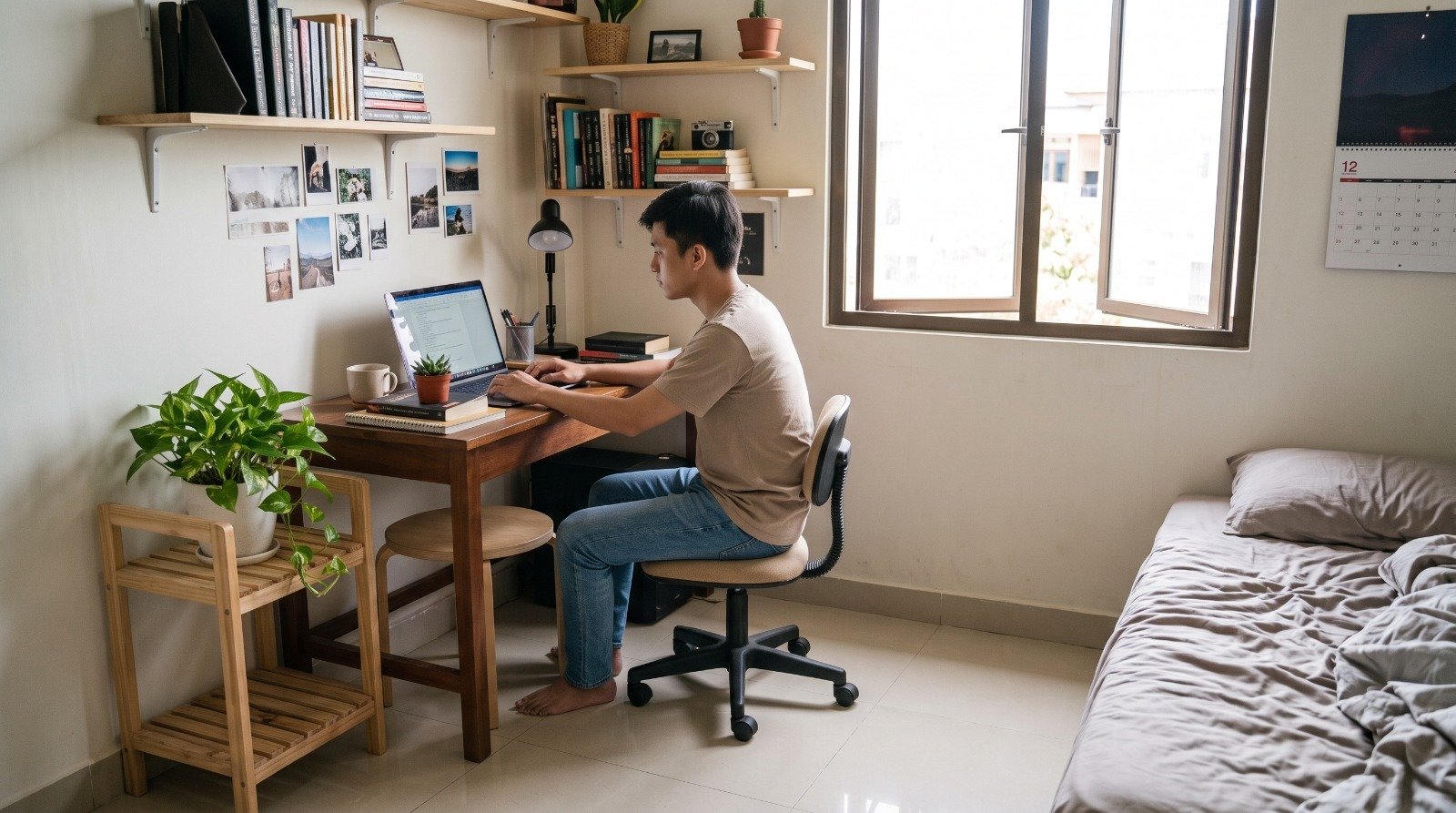
Pekerja & Mahasiswa
Jadikan tanaman hidup sebagai teman di ruanganmu. Berbeda dengan buket bunga potong yang usianya singkat, koleksi BERMEKARAN akan terus tumbuh, bernapas, dan mekar menemani hari-harimu agar selalu terasa asri.
04
Pencari Hadiah & Dekorasi Acara
Pilihan untuk ulang tahun, wisuda, anniversary, maupun
momen spesial yang ingin dibuat lebih berkesan.
Cerita dari Pelanggan
Testimoni Pelanggan
Cerita dan pengalaman pelanggan setelah menerima tanaman dan bunga
dari BERMEKARAN.
“
Senang banget, bunganya sudah datang! Real pict, sangat segar, dan rimbun. Jangan ragu belanja di BERMEKARAN, pokoknya nggak nyesel dan suka banget!
Customer 1
“
Terima kasih, paket sudah sampai. Bunganya dalam keadaan masih sangat segar dan bagus. Semoga bunganya cepat mekar dan awet.
Customer 2
“
Paketnya sudah sampai, tanamannya masih segar dan tidak layu. Packing rapi dan aman, bunganya lengkap, banyak yang masih kuncup. Puas banget, terima kasih!
Customer 3
“
Tanaman sampai dengan aman, daun masih segar dan bagus semua. Packaging-nya juga top. Semoga bisa tumbuh dengan daun lebat dan berbunga indah.
Customer 4
“
Alhamdulillah, paket bunganya sudah mendarat. Masyaallah, bagus dan masih segar bunganya. Terima kasih banyak!
Customer 5
Harga tercantum sesuai daftar harga. Silakan konfirmasi
ketersediaan stok dan detail pemesanan melalui WhatsApp.
Mari Mulai Sesuatu yang Indah
Satu Tanaman, Banyak Cerita Indah.
BERMEKARAN bukan sekadar tempat membeli tanaman dan bunga, tetapi
juga tempat untuk menghadirkan keindahan dan kesegaran di setiap
sudut kehidupan. Dengan pilihan tanaman dan bunga yang beragam,
kualitas yang terjaga, serta pengalaman berbelanja yang nyaman dan
berkesan, BERMEKARAN siap menjadi pilihan utama Anda untuk setiap
kebutuhan tanaman dan bunga. Karena setiap sudut punya cerita, dan
BERMEKARAN hadir untuk membuatnya lebih bermakna.
Sekali Mekar, Selalu Berkesan.
BERMEKARAN, Awal dari Keindahan.
Hubungi kami untuk bertanya tentang produk, stok, dan pilihan tanaman.
/*
KONFIGURASI WHATSAPP BERMEKARAN
*/
const WHATSAPP_NUMBER = "6283188422124";
function setupWhatsAppLinks() {
const links = document.querySelectorAll(".wa-link");
const validNumber = /^[1-9]\d{7,14}$/.test(WHATSAPP_NUMBER);
links.forEach((link) => {
const message = link.dataset.waMessage || "Halo BERMEKARAN!";
const encodedMessage = encodeURIComponent(message);
if (validNumber) {
link.href = `https://wa.me/${WHATSAPP_NUMBER}?text=${encodedMessage}`;
link.target = "_blank";
link.rel = "noopener noreferrer";
link.removeAttribute("aria-disabled");
} else {
link.href = "#";
link.removeAttribute("target");
link.setAttribute("aria-disabled", "true");
}
});
}
document.getElementById("current-year").textContent = new Date().getFullYear();
setupWhatsAppLinks();
// Carousel Testimoni
const testimonialSlider = document.getElementById("testimonial-slider");
const testimonialTrack = testimonialSlider?.querySelector(".testimonial-track");
const testimonialPrev = document.querySelector("[data-testimonial-prev]");
const testimonialNext = document.querySelector("[data-testimonial-next]");
function scrollTestimonials(direction) {
if (!testimonialSlider || !testimonialTrack) return;
const firstCard = testimonialTrack.querySelector(".testimonial-card");
if (!firstCard) return;
const cardWidth = firstCard.getBoundingClientRect().width;
const trackStyles = window.getComputedStyle(testimonialTrack);
const gap = parseFloat(trackStyles.columnGap || trackStyles.gap) || 0;
testimonialSlider.scrollBy({
left: direction * (cardWidth + gap),
behavior: "smooth"
});
}
testimonialPrev?.addEventListener("click", () => scrollTestimonials(-1));
testimonialNext?.addEventListener("click", () => scrollTestimonials(1));
 BERMEKARAN
 01
 02
 03
 04